Chaser Dashboard
Rebuilding a Slack-native task tool's web dashboard so it could do what Slack structurally can't.

Context
Chaser is task management that lives where teams already work, which is Slack. Tasks get created, assigned and updated inline, in the conversation that produced them.
That works right up until you need to see everything at once, because a thread only shows you one task at a time and it cannot show you a filtered view of forty of them, or the state of a whole project. So Chaser built a web dashboard alongside the Slack experience.
The dashboard was not doing that job yet. Users found it confusing, functions they needed were missing, filtering broke down on long lists, and mobile was unusable. The complaints were specific and consistent, which is a good place to start from, because nobody was still arguing about whether there was a problem.
Chaser brought me in as a contract designer in 2026 to redesign it.
My Role
Lead product designer for the dashboard redesign, working directly with the product owners.
They came to me with problems rather than with a solution they wanted drawn up. Some constraints were fixed: the Slack integration, the data model, and what the product had already promised users. Everything else was open and the structure was mine to propose, so how tasks are represented, how editing works, how filtering behaves, and how the whole thing holds up as the screen gets smaller.
I designed the full dashboard, 34 views across three breakpoints, plus the visual language and the 36 component design system underneath it, built out on an existing foundation (Untitled UI). I stayed engaged with engineering through the build rather than handing off and leaving.
Discovery & Research
The client arrived with sustained, specific user feedback, so the symptoms were already known. I ran discovery on top of that rather than treating their summary as the answer.
As an outside contractor I had no standing access to Chaser's users, so the research ran asynchronously through the client's own channels:
Audited the existing dashboard end to end, cataloguing what was broken myself rather than working from the complaint list
Compiled the client's existing user research into a single picture
Ran a UX survey campaign, 18% response rate
Corresponded directly with users by email, following up wherever a survey answer needed pushing on
Reviewed product analytics to see where behaviour and reported experience diverged
Three complaints kept repeating: the dashboard was confusing, it could not do things people needed, and filtering was confusing
All of those came back to one cause. The dashboard had been built to extend what you could do with Chaser tasks beyond Slack, and it had not got there yet. The capability it existed to add was either missing outright or did not work well enough to be worth opening a browser tab for.
What I Built
A defined boundary between Slack and the web. Slack stays where work is captured, in context and in conversation. The dashboard is for the holistic view, so many tasks at once, filtered, sorted and edited in volume. Every decision after that one came from that line.
A real data view. Filtering and sorting as first-class behaviour rather than an add-on: 8 filter dimensions, groups, favorites, 6 sortable columns, saved views, and a second layer of 8 one-click status filters above the list. The date filter alone carries 12 relative presets plus custom dates and ranges.
Multi-select and bulk editing, both new to the product. Chaser had never had either, and structurally could not, because you cannot select forty things at once inside a conversation. This is a capability that surface cannot offer at all, rather than a nicer version of something Slack already does.
Charting, built properly and then deliberately restrained. I designed reporting, then scaled its presence back, because the evidence said the value here was seeing and acting on many tasks rather than visualising them.
A design system, built out on an existing foundation. The product had no consistent visual language at all. Rather than spend a contract engagement redrawing buttons, I started from a base library and put the time into what was Chaser-specific: 36 components and 429 variants covering tasks, tables, charts, filters, editing and notifications, against 10 text styles, 11 effect styles, 66 variables, and 17 documented pages.
Designed for density, and for the people density excludes. Dense data products fail in two directions. They overwhelm people who need to scan, and they shut out people who need larger text. So I built a compact density mode, an increased-font mode, a dark theme, and focus states as named reusable styles rather than leaving them to the browser default.
The unglamorous states. Loading, empty, no-results, success and confirmation views, plus motion specs for the interactions that needed them, so the cases that normally generate mid-build questions were answered before the build started.
What Was Hard
Every Chaser user already knows the Slack version, and that is a real asset, because anything they recognise is something you do not have to teach them. The obvious move is to carry those patterns across so nothing feels unfamiliar. But the dashboard exists to do the things Slack cannot do, and those things have no Slack equivalent to borrow from.
So the judgment I kept having to make was which Slack conventions to honor and which ones to break.
I broke from Slack on list and filter behavior. Slack's model is a linear stream, one item after another, in the order it happened, and there is no way to express "show me everything blocked and assigned to this person, sorted by date" in that model. Keeping the familiar version would have kept exactly the limitation that made a dashboard necessary in the first place. That decision was mine and I would make it again.
My first version of it then failed the test anyway. Across two rounds of testing, users had trouble combining multiple filter types to get the results they wanted, which is the same failure I had broken from Slack to fix, showing up inside my own solution. I restructured it around the path users took naturally instead of teaching them the path I had drawn.
Being right that the pattern needed breaking did not tell me much about what should replace it, and I had to find that out the same way as everybody else.
Everywhere else I stayed close to Slack on purpose, so the unfamiliarity was spent in one place rather than spread across the whole product.
What Happened
Fully shipped and live. The engineering team built directly from the files and the design system.
It shipped in pieces rather than as one launch, and I stayed engaged across the rollout, reviewing what got built against the designs, answering questions as they came up, and writing the documentation the files did not already cover.
The complaints that prompted the engagement were resolved. Filtering works properly now, the functions people were missing exist, and mobile is usable.
Multi Select UI

Intuitive UX / Full State Coverage
Mobile Task Management
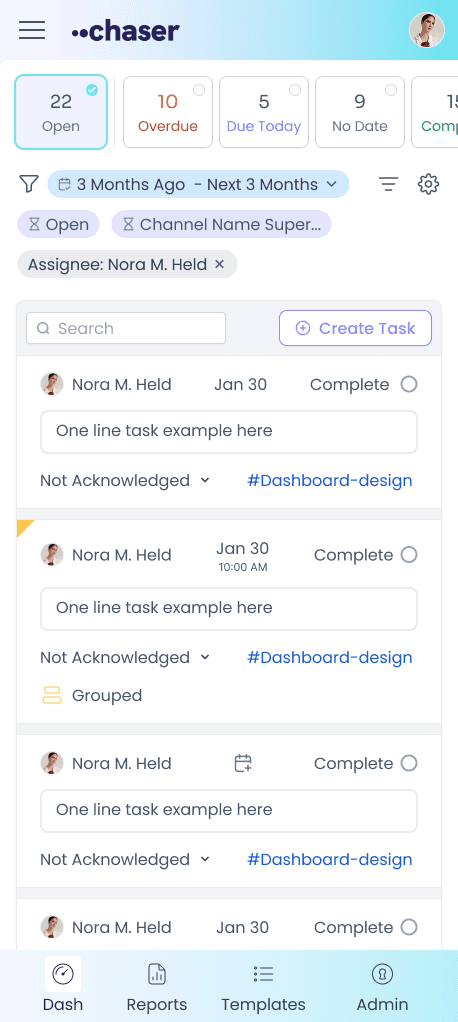
Responsive workflows / Tasks anywhere